Alvorô
Case study
↓
Project Overview
We celebrate real food,
and the pleasure
of eating well.
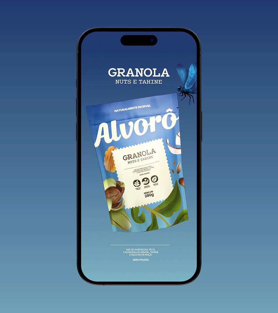
The new identity for Alvorô, a Brazilian food brand built around clean ingredients and PANCs, the country's underexplored unconventional edible plants, was created to defend a more honest way of eating. The brand needed a new name and a visual system capable of sustaining its growth potential, translating its essence with more charisma, presence and differentiation.
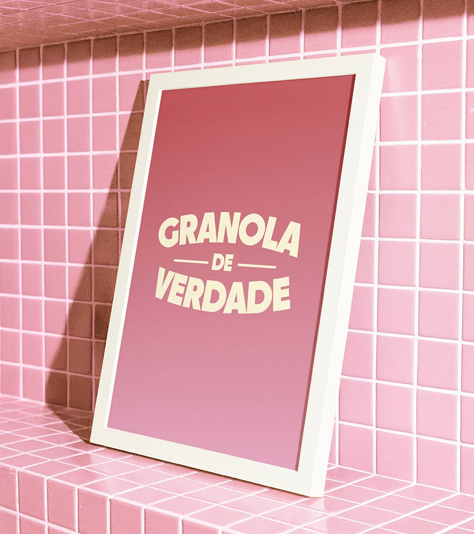
Alvorô is an affectionate neologism derived from alvoroço, evoking surprise, delight and vitality, while suggesting alvorada, the break of dawn, and the idea of beginning again. Fluid letterforms carry the handmade warmth of the brand, a palette drawn from sunrise balances earth tones with vivid orange, and the packaging system separates flavors by color to strengthen recognition across the line.
Role: Art Direction & Design
Illustration: Martina Hotzel
Strategy: Rafaela Sotuyo, Hemelyn Haertel, Letícia Marcondes
Motion: Lauro Henn, Diony de lara
3D: João Pedro Ribeiro
Project Management: Natalia Favero